Organising your talent
Pinpoint ATS
Role
Senior Product Designer
Tools
Figma, FigJam, Linear, Notion
Year
2026

01.
Introduction
Pinpoint had two separate places to find candidates: All Candidates and Talent Pipeline. Different surfaces, similar modals, but they behaved in fundamentally different ways.
In All Candidates, you could apply filters and save them as Views, but a View was purely a saved filter. Talent Pipeline was a standing list that automatically added and removed people as they matched its rules, and could hold manually added candidates too - but gave you no way to shape how people entered and left.
The deeper problem was conceptual. To a recruiter working a role, a job seeker and an applied candidate are one and the same - both potentially in the running for the job. But the product presented them as two separate things, in two separate places, forcing recruiters to hold a distinction that only existed in the software, not in their work.
I led the effort to consolidate both into one surface, letting recruiters decide how each list is built and maintained, so the tool matched how they already thought, instead of asking them to think like the tool.
It's live design work, still in flight; what's settled is the model and flow below, and the reasoning that got there.
Existing All Candidates

Existing Talent Pipeline

02.
Problem
A list had to be more than a saved search. Some recruiters wanted to hand-pick candidates and keep them there. Others wanted the list to maintain itself - pulling people in as they matched a set of rules, dropping them as they stopped. Plenty wanted both at once. So a "list" was really a question in disguise: who decides who's in it - the recruiter, the system, or both?
The first version we put in front of users tried to answer that by exposing all the configuration options at the point of creation: the full search and filters, fully editable, plus two automation toggles - one for adding new matches, one for removing candidates who no longer matched. It was overwhelming, which confirmed a worry we'd raised before testing: handing people the entire editing surface at the moment of creation was too much.
The Tell:
At the automation toggles, people slowed down. Not because they couldn't find them - because they weren't sure what the system would do on their behalf. Do I want it adding and removing candidates on its own?
Insight:
A list isn't one thing. The design problem was never laying the controls out - it was making the choice clear: hand-picked, self-maintaining, or both, and obvious which one you're building.
03.
Challenge
How do you let someone create a list that can be manual, rule-driven, or a mix of the two - and make which one they're building obvious from the first click, without dumping every control onto one screen?
I didn't want to argue my way to the answer. I prototyped it.
04.
Building to think
I prototyped five full approaches to list creation and walked them end to end in a design crit rather than debating them abstractly:
1.
Simple list creation, and then pushing users to a configuration page
Felt disconnected; people lost their sense of place in the product.
2.
Allow users to input configuration in an inline expanding section
Cluttered the view, and blurred the line between filters and criteria
3.
Editable drawer, everything inline
Boolean search terms were unreadable when crammed into one input
4.
Drawer with criteria as on/off toggles
Easier to read, but four toggles with no context just moved the confusion.
5.
Split the action by intent
Provide multiple actions dependent on the user's intent - Removing inline editing/toggling.
Design critique narrowed the field, eliminating three approaches before testing. Option 4 was the version that went in front of users. I iterated it live between sessions (small tweaks, same underlying model) until, about six sessions in, the direction was clear enough to switch the model itself. The final two sessions tested option 5 - the split - as validation of everything the first six had surfaced.

05.
Decisions
Split by intent. The breakthrough was realising the two things people wanted weren't one action with options - they were two different starting points, and the interface should offer both as doors:
New list
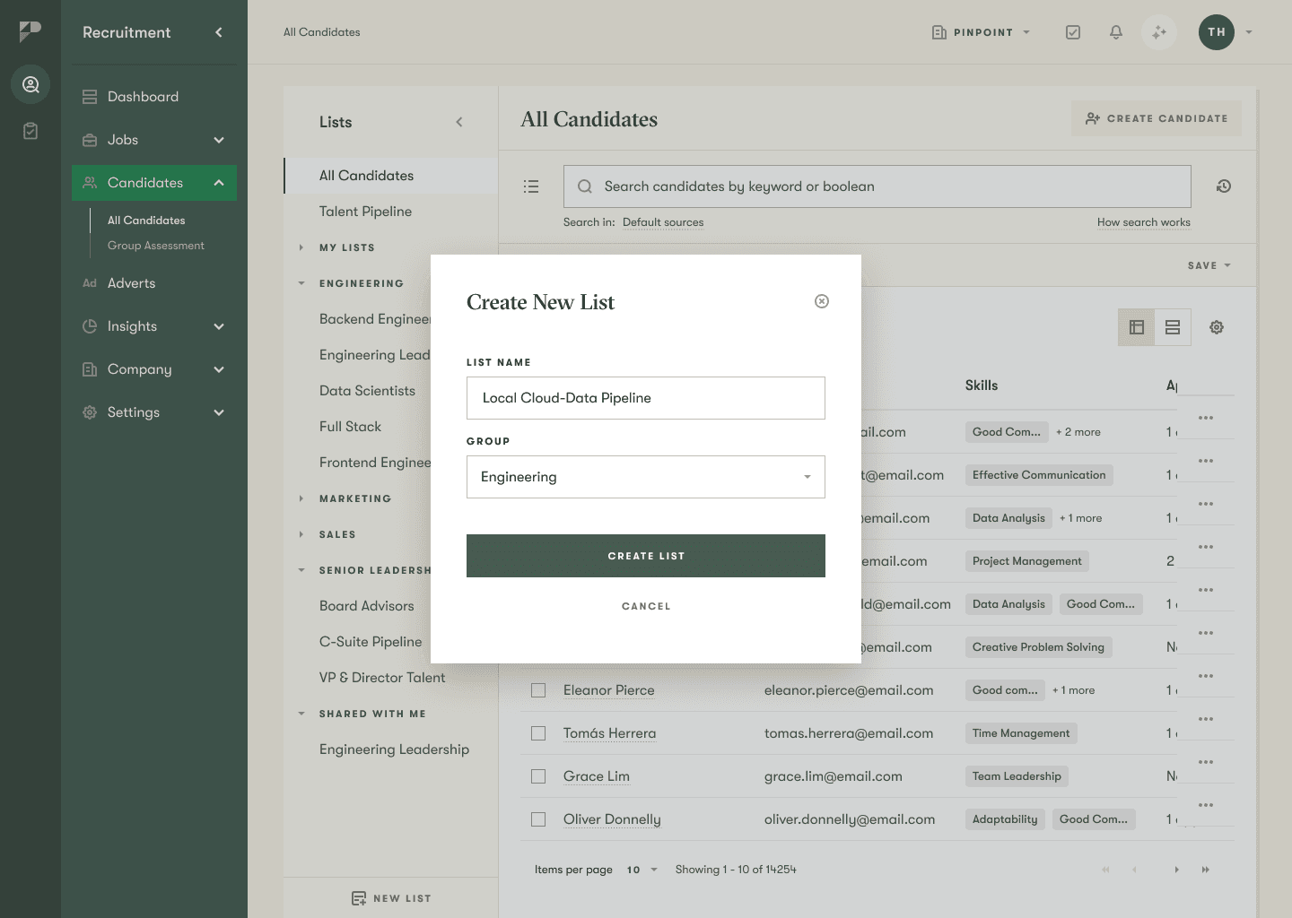
Opens an empty modal - name and group only - and carries no criteria across. This is the hand-picked list: you start empty and add people yourself.
Save as new list
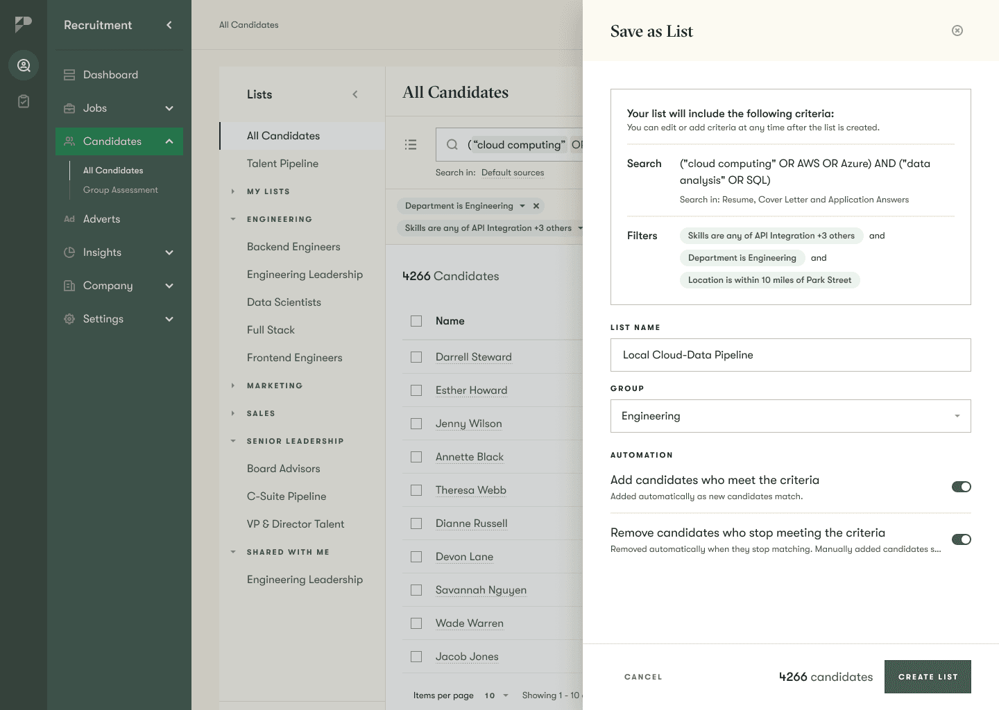
Captures your current search and filters. This is the self-maintaining list: it starts from criteria and can keep itself up to date.
One click, and you've already told the system which kind of list you're building. Forcing both down a single control had always felt wrong; separating them by intent made the choice legible instead of buried in a settings screen.
I reopened a decision the team had already closed. The call had been made to drop manual members from rule-driven lists - cut as complexity no one had asked for. I disagreed, and rather than argue it in the abstract I pulled our own usage data: roughly a third of existing pools already blended both member types. Shipping without it wouldn't have been a simpler v1 - it would have been a regression for the customers who relied on it most. I made that case with the evidence until the decision was reversed.
Criteria first, name second. In the drawer, I led with a read-only recap of the criteria, then name, group and automations. This came from testing on myself: name-first meant typing a name, spotting a wrong filter, cancelling, and re-typing the name on the way back. Leading with the criteria makes backing out a single click with zero wasted effort.
Reduce the editable surface at the moment of creation. This answered the overwhelm. Fewer things to configure and second-guess before you understand them: the read-only recap replaced the fully-editable criteria, and the reassurance that criteria can be changed any time moved into an info popover rather than a permanent line of hand-holding.
I probably wouldn't have ended up here without watching people use it.
All Candidates - Create New List
All Candidates - Save as List
06.
Handing it to engineering
Deciding the flow is only half the job; the other half is making it survive the build. I owned the spec and tickets myself, to one rule: point engineers at the source of truth, don't transcribe it - restating a decision is how a spec and a design quietly drift apart and contradict each other months later.
The real risk on a merge this size isn't a wrong pixel - it's the design and the build silently disagreeing six months later, after everyone's forgotten why. Owning the spec myself was how I made the decision durable, not just the design.

07.
Running the research, not just sitting in it
The first round had been unmoderated, and it produced "don't like it" with no why - useless for a decision this subtle.
So I switched to moderated sessions and ran them as a loop, not a batch - redesigning overnight and re-testing the same areas the next day, so each session steered the next. Most usability studies can only refine the thing you walked in with; this gave the study permission to invalidate its own premise - and it did: it killed 'put every control on one screen' and replaced it with splitting by intent. The method didn't just improve the design; it changed which design we were building.

08.
Outcome
The research shaped this directly. Watching people use option 4 across the first six sessions is what turned "put all the controls on screen" into "split the list by intent." The final two sessions tested that split - option 5 - and users picked it up straight away: they understood what a list was for, and that its membership was theirs to decide - manual, self-maintaining, or both.
I'm treating that as promising, not proven. The remaining validation is planned but deliberately staged - a call I made. Over-testing one flow with a small pool would have bought false confidence; letting it prove itself under the weight of the features built on top of it is the more honest signal. Knowing when not to gather more data is its own decision - and it was mine to make.
It hasn't shipped either, so there are no adoption numbers yet. And some things are honestly still unresolved: the automation toggles land better than they did, but I'd want more confidence people fully trust what they'll do, and whether "List" and "Talent Pipeline" are one concept or two is still open. A real project doesn't tie off neatly.
All Candidates - Save as List
Curated List
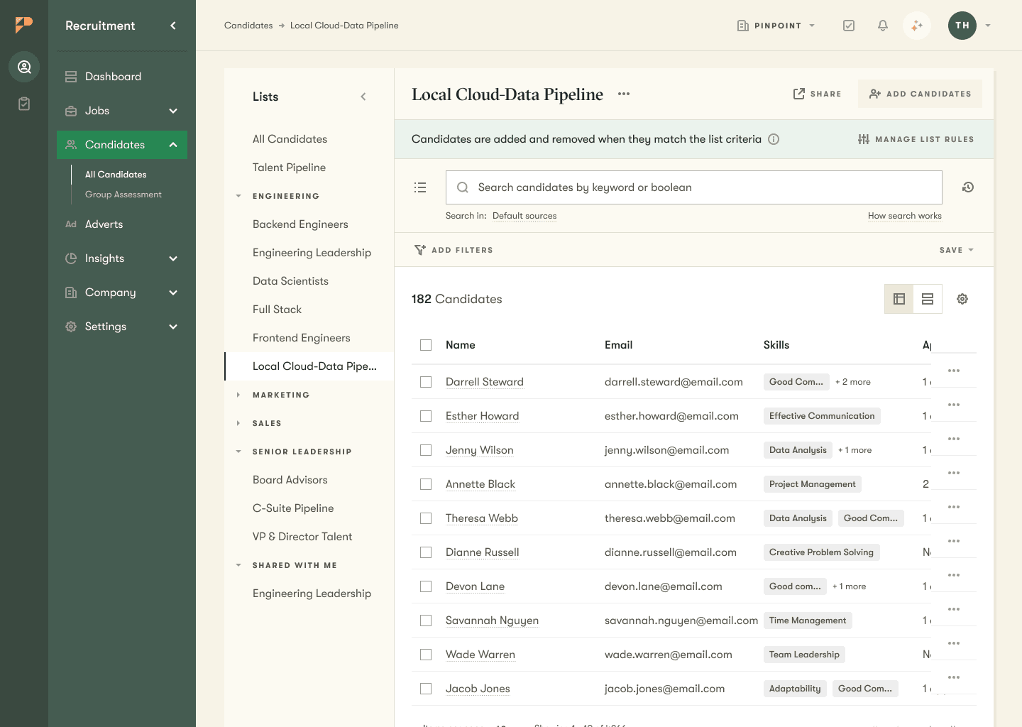
Blank List